Case Study: Cinch Transaction Services Website Redesign
Elements: Web Designs | SEO | Ecommerce | UX
Problem:
Cinch Transaction Services needed a dynamic, user-friendly website to streamline real estate transactions while enhancing brand visibility. The existing site lacked modern design, optimized performance, and seamless e-commerce integration, resulting in lower engagement and potential missed business opportunities.
Solution:
Our team partnered with Cinch Transaction Services to deliver a robust website redesign focused on:
Web Design & Development: Created a visually stunning and intuitive interface, prioritizing user experience.
SEO Integration: Implemented advanced SEO strategies to improve search engine ranking and drive organic traffic.
Optimized Graphics & Loading Speed: Enhanced site performance with compressed, high-quality images and graphics.
Commerce Integration: Seamlessly integrated e-commerce features, enabling smooth transaction processes.
Imagery & Branding: Used professional, relevant imagery to align with the brand’s vision and appeal to the target audience.
Results:
Increased Engagement: 35% rise in site visits within the first month.
Faster Load Times: Achieved a 50% improvement in loading speed.
Improved Transactions: Enhanced commerce functionality led to a 20% boost in completed transactions.
Case Study: Brand Identity Design for The Law Office of Nigel Phiri, ESQ. LLC
Overview
In the heart of Atlanta’s competitive legal market, The Law Office of Nigel Phiri, ESQ. LLC needed a brand identity that commanded respect and reflected unwavering legal protection. Specializing in cases like wrongful death and car accidents, Attorney Phiri sought a design that projected authority, trust, and readiness for justice.
The Objective
Create a strong, iconic brand identity that reflects the firm’s commitment to providing protection under any circumstance and helps the firm stand out among Georgia's top legal entities.
The Solution
I crafted a bold, professional logo that encapsulates legal strength and integrity. The design integrates the letter "N" within a sharp, shield-like frame to signify protection and resilience. Inside, a modern silhouette of Lady Justice subtly emerges—balancing the scales and wielding a sword—conveying both fairness and strength. The column behind her hints at legal tradition and structure, grounding the firm in legitimacy.
This balanced composition of classical symbolism and modern typography makes the logo timeless yet memorable—positioning The Law Office of Nigel Phiri as a trustworthy powerhouse in the legal industry.
Results
The final brand identity exceeded the client’s expectations, presenting the firm as a premier legal office in Georgia. It now serves as the centerpiece for all professional materials, including signage, digital assets, and client communications—setting a bold tone for the firm’s mission and reputation.
Case Study: Ginger Yums Brand Design
Problem:
Ginger Yums, a natural juice company based in Atlanta, GA, needed a vibrant and cohesive brand identity to stand out in the competitive health beverage market. The brand aimed to highlight the health benefits of its ginger-based juices while showcasing its variety of delicious flavors. However, without a strong visual identity, Ginger Yums struggled to effectively communicate its brand story and attract its target audience.
Solution:
Our creative team partnered with Ginger Yums to develop a dynamic brand design that embodied the fresh, healthy, and flavorful essence of their product:
Logo Design: Created a bold, energetic logo that captured the brand's natural and revitalizing qualities.
Color Palette: Chose vibrant, refreshing colors that reflect the diverse flavors and health benefits of the juice.
Packaging Design: Designed eye-catching and informative packaging, ensuring brand consistency and appeal on store shelves.
Marketing Materials: Developed engaging visuals for social media, print, and promotional campaigns to amplify brand presence.
Brand Messaging: Crafted a clear and authentic brand voice that emphasized the unique health benefits of ginger and the deliciousness of the flavors.
Results:
Increased Brand Recognition: Boosted social media engagement by 40% within three months.
Sales Growth: Contributed to a 25% increase in sales after the rebrand launch.
Enhanced Market Positioning: Helped Ginger Yums secure new retail partnerships and expand its market reach.
Find them on social media @gingeryums
A Brand Logo Design for Professional Wedding DJ Group. This design was a joy. I was able to capture the essence of the DJ’s with a modern timeless logo.
Contact them at yo@thehypemen.com with the subject line "I'm ready to party"
Follow them on social media
Case Study: Orange – Podcast & Social Media Design for Faith-Based Leadership
Client: Orange
Industry: Faith-Based Leadership, Education
Project Scope: Social Media Design, Podcast Marketing, Curriculum Graphics
Deliverables: 150+ mobile & desktop graphics
Orange is a collective of passionate leaders dedicated to empowering churches and families to shape the faith and character of the next generation. For this project, I was tasked with enhancing the visual presence of their OrangeLeaders Audio Blog—a podcast resource focused on equipping ministry leaders with the tools and insights to lead effectively.
Using strategic design and creative storytelling, I developed over 150 custom graphics optimized for both mobile and desktop use. These visuals supported their audio blog content across platforms and helped increase engagement with key topics such as “Leading Through Change,” as shown in the image.
Each graphic was designed to maintain brand consistency while adding visual clarity and emotional connection, helping Orange communicate their leadership curriculum in a fresh and accessible way.
From podcast cover art to social media shareables, the assets produced helped reinforce Orange’s message and further their mission to develop strong, faith-driven leadership.
Case Study: U.S. Cabinet Depot – Design That Drives Growth
Client: U.S. Cabinet Depot
Industry: Cabinetry Wholesale
Project Scope: Style & Spec Book Design, Social Media Marketing, Digital Website Art
Objective: Increase sales and elevate brand appeal through dynamic, sales-driven visual design.
The Challenge
U.S. Cabinet Depot, the #1 cabinetry wholesaler in the U.S., needed compelling visuals to match their industry-leading products. With a wide variety of framed and frameless styles, the brand sought to modernize its visual presence and create a more engaging, conversion-focused customer experience across print and digital.
The Approach
To support their expansion goals and boost market impact, I delivered a range of high-quality creative assets:
Style & Spec Book Editorial Design: I crafted clean, on-brand layouts showcasing their full line of cabinets. The designs offered a polished, professional look while simplifying complex information for distributors and customers.
Social Media Marketing Banners: I developed visually striking marketing banners for campaigns promoting new products, promotions, and brand messaging, tailored to contractors and end consumers.
Digital Website Art: Refreshed digital graphics and visuals helped create a more user-friendly and appealing web experience, supporting online engagement and driving conversions.
The Outcome
Sales Growth: The fresh, on-brand visuals contributed directly to an increase in both interest and conversions.
Product Expansion: The company successfully launched multiple new items and options, using the new visuals to spotlight innovation and craftsmanship.
Brand Positioning: U.S. Cabinet Depot strengthened its status as a premier cabinetry supplier, especially within the Atlanta, GA market and beyond.
Conclusion
Through a mix of editorial design, digital marketing visuals, and strategic art direction, I helped U.S. Cabinet Depot amplify its brand voice, better connect with its audience, and support ongoing product expansion in a competitive space.
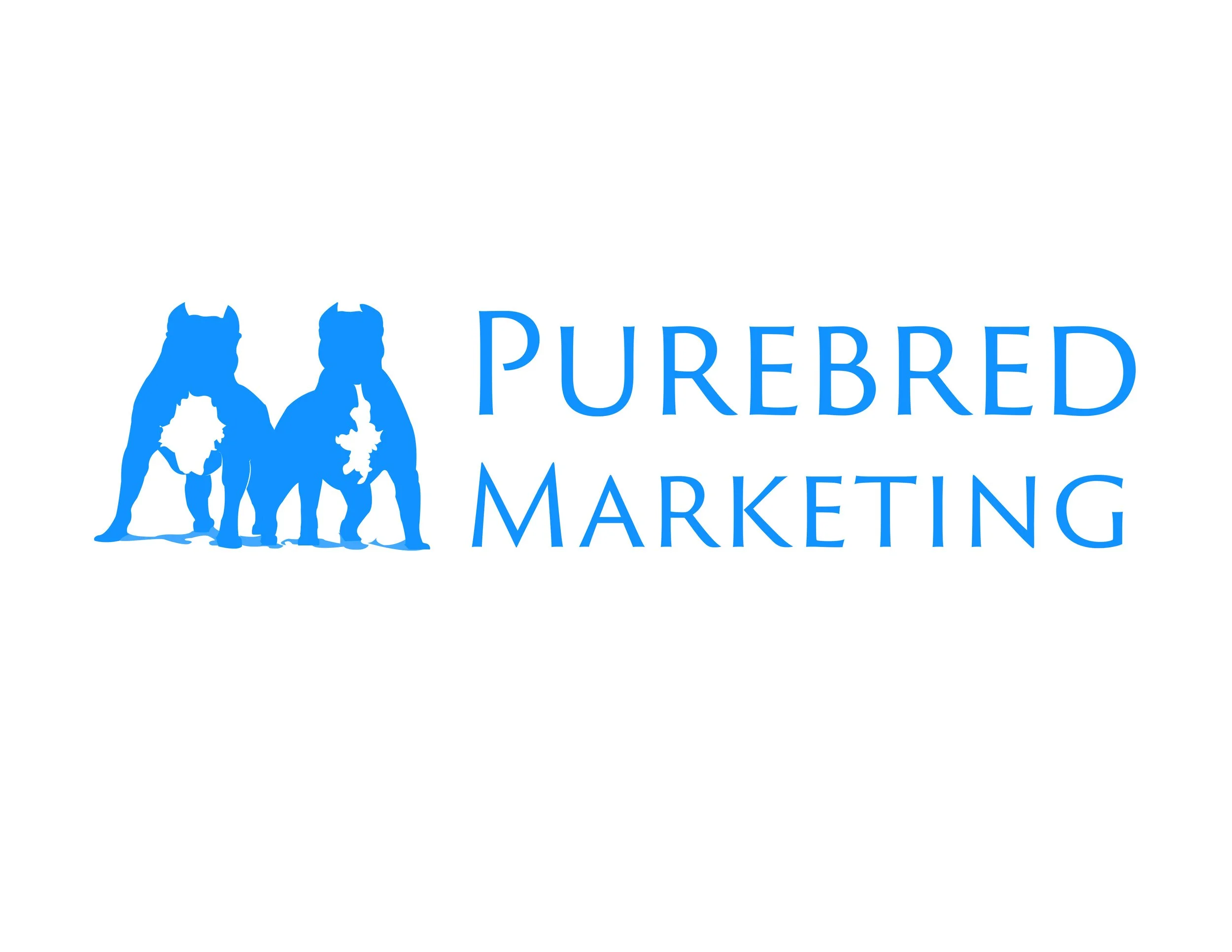
PureBred Marketing
Brand Identity & Logo Design Case Study
Project Overview
Client: PureBred Marketing
Industry: Digital Marketing / Canine Breeding
Services: Brand Identity, Logo Design, Visual Direction
https://purebredmarketing.com/
PureBred Marketing approached PJJ Designs with a unique challenge: create a brand identity that could authentically represent both sides of their business — a modern digital marketing agency and a professional pitbull breeding brand. The goal was to develop a logo that felt bold, credible, and versatile, while also honoring the “purebred” concept at the heart of their story.
The Challenge
PureBred Marketing needed a logo that:
Reflected professionalism and credibility in the marketing space
Paid homage to their roots in pitbull breeding
Felt strong, confident, and memorable
Worked across digital platforms, merchandise, and social media
The key challenge was balancing corporate brand appeal with cultural authenticity — avoiding anything that felt gimmicky or overly aggressive, while still embracing the power and identity of the breed.
The Strategy
The creative direction focused on symbolism and dual meaning.
Rather than designing a generic agency logo, the concept leaned into:
The “PureBred” name as a metaphor for quality, pedigree, and excellence
The pitbull as a symbol of strength, loyalty, confidence, and resilience
A brand mark that could function both as a business logo and a lifestyle emblem
The logo needed to feel like a badge — something that could stand on its own.
The Design Solution
The final logo features a bold pitbull icon paired with clean, modern typography, creating a strong visual identity that bridges both worlds.
Key design elements include:
Iconic Pitbull Mark – Represents power, loyalty, and brand roots
Strong Linework & Symmetry – Communicates structure, discipline, and professionalism
Minimal Color Palette – Keeps the brand clean, timeless, and versatile
Scalable Design System – Works seamlessly across web, apparel, social, and print
The result is a logo that feels street-smart yet corporate, bold yet polished — a brand identity that tells a story before a single word is read.
The Outcome
PureBred Marketing now has a brand identity that:
Instantly communicates confidence and authority
Differentiates them in a saturated marketing landscape
Creates a strong emotional connection with their audience
Functions as both a business brand and a cultural symbol
The logo has become the cornerstone of their visual presence — adaptable across their website, social platforms, merchandise, and future brand extensions.
Case Study: Kells Sells – Real Estate Branding with Personality
Client: Kells Sells
Locations: Nashville, TN | Atlanta, GA | Los Angeles, CA
Project: Brand Identity Design
Industry: Real Estate
Overview:
Kells Sells is a multi-city real estate powerhouse with thriving business in Nashville, Atlanta, and Los Angeles. Known for her dynamic presence and client-first approach, Kells wanted a brand identity that captured both her expertise in real estate and her magnetic, down-to-earth personality.
The Challenge:
Kells approached me with a vision: to create a brand that would be warm, welcoming, and trustworthy—yet still reflect her stylish, energetic, and fun-loving spirit. She wanted something that would stand out in the real estate market, appeal to both first-time buyers and seasoned homeowners, and ultimately, be unforgettable.
The Approach:
To bring her vision to life, I focused on blending professionalism with personality. I explored design elements that felt both modern and timeless, ensuring the brand would resonate across different markets and demographics. I incorporated:
Real estate motifs such as rooftops, keys, and doorways to ground the design in the industry.
Vibrant, welcoming colors that conveyed approachability and confidence.
A custom logo that balanced sophistication with playful flair—an emblem that truly felt like Kells.
Clean typography paired with creative flourishes to make the brand visually memorable and adaptable across digital and print.
The Result:
The final brand identity delivered exactly what Kells envisioned: a stylish, warm, and memorable presence that feels right at home in every city she serves. The logo acts as a visual handshake—instantly friendly, instantly recognizable.
From business cards to social media, the new Kells Sells branding is cohesive, eye-catching, and uniquely hers. It’s more than just a look—it’s a vibe that says: Kells Sells, and she does it with style.
Brand Logo Design for the Metro Center Healthcare Group based out of Nashville, TN. The design is meant to inspire the consumer to let them know they are in safe hands.
They are a long-standing Internal Medicine and Family Medicine practice proudly serving the greater Nashville, Tennessee community.
Website: https://metrocenterhealth.com/
Client: Solace
Service Provided: Brand Identity & Logo Design
Project Goal: Create an elegant, high-end brand identity for a premium wellness company focused on holistic health.
The Challenge
Solace approached me with a vision: to establish a brand that radiates sophistication, warmth, and trust. As a company rooted in full-spectrum wellness—covering mind, body, and spirit—they needed a visual identity that would reflect their high-end offerings while remaining approachable and calming for their clientele.
The Approach
Discovery & Direction:
We began by exploring the brand’s core values: serenity, luxury, and empowerment through wellness. These values guided every decision, from typography to symbolism, ensuring the identity would speak directly to a discerning and wellness-conscious audience.
Logo Design:
The final logo design [see image above] features an elegant, symmetrical emblem inspired by both lotus and mandala motifs—symbols of balance, growth, and inner peace. The soft gold and warm brown gradient adds depth and luxury, evoking a sense of calm sophistication. Paired with a clean, high-contrast serif font, the overall composition delivers a strong yet graceful presence that instantly commands attention and trust.
The Outcome
Timeless Elegance: The Solace logo captures both strength and serenity, visually embodying the brand’s essence in a single mark.
High-End Feel: The design appeals to premium markets while remaining inclusive and welcoming.
Brand Confidence: The logo instills trust and professionalism, encouraging clients to feel secure and cared for in every Solace experience.
Conclusion
Solace’s brand identity is a testament to the power of thoughtful, intentional design. Through a strong yet graceful logo, we created more than just a visual—it’s a feeling, an experience, and a promise to every client that they are in expert, nurturing hands.
Case Study: Crafting the Flavor of Gigi’s
Client: Gigi’s
Service Provided: Brand Identity & Logo Design
Project Goal: Develop a distinctive logo to establish the brand and support future product packaging and marketing.
The Challenge
Gigi’s was a new sauce brand entering a competitive market filled with both artisan and mass-market players. The founder needed a logo that would immediately convey flavor, quality, and authenticity while standing out on shelves and online. The identity had to be versatile enough to work across future packaging, merchandise, and digital platforms.
The Approach
Discovery & Strategy:
We began with a conversation about the heart of Gigi’s—what made the sauce unique, who the target audience was, and how the brand wanted to be perceived. This laid the foundation for a design approach that combined tradition, warmth, and culinary flair.
Logo Design:
The final logo is a vibrant, memorable mark that blends handcrafted charm with a modern edge. Typography, iconography, and color were carefully selected to evoke the homemade feel of the product while maintaining a professional, scalable identity for retail use.
Brand Consultation:
Beyond the logo, I provided marketing feedback to support Gigi’s broader goals. This included:
Suggestions for packaging layouts and label concepts
Visual direction for social media branding
Insight on how to position the brand in local markets and online
The Outcome
Strong Brand Foundation: Gigi’s now has a cohesive, versatile logo that anchors their entire visual identity and can be applied seamlessly to future products and campaigns.
Market-Ready Presence: The logo design has already elevated the product’s perceived value, helping the client make a confident entrance into local markets and food expos.
Strategic Support: My marketing input gave the client a clearer path forward, including ideas for how to launch, engage with their audience, and grow their brand presence.
Conclusion
This project was about more than just design—it was about helping a new brand tell its story. From first impressions to shelf appeal, the Gigi’s logo now captures the essence of the product and supports the business as it grows into a household name.
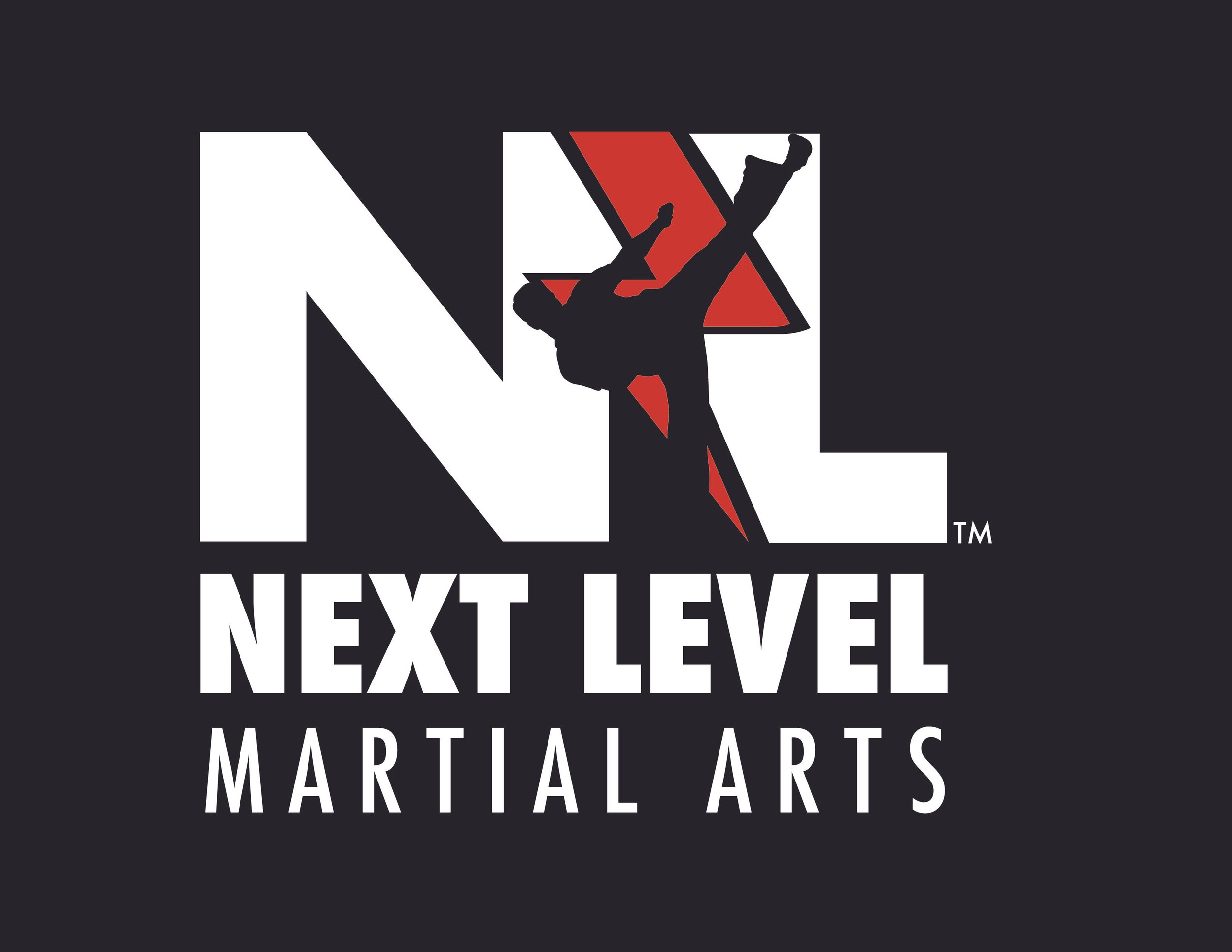
Case Study: Building the Brand for Next Level MA
Client: Next Level Martial Arts
Services Provided: Logo Design, Website Design, Flyer Design
Project Goal: Promote the brand and increase student enrollment across multiple martial arts locations.
The Challenge
Next Level MA was looking to solidify its presence in a competitive martial arts market. The brand needed a cohesive visual identity and strong promotional tools to attract new students and support future expansion. The client’s ultimate goal was to increase enrollment at the existing location and use that momentum to grow into additional markets.
The Approach
Logo Design:
We started by creating a bold, modern logo that reflected the discipline, strength, and energy of martial arts. The design balances professionalism with approachability—targeting both parents and students. The logo established a strong visual anchor for the brand across all marketing materials.
Website Design:
The website was designed to be both visually dynamic and highly functional. We prioritized user experience with clear calls-to-action, simplified class scheduling, and responsive mobile design. Key features included:
Class descriptions and schedule integration
Testimonials and instructor bios to build trust
A direct inquiry form to boost conversions
Flyer Design:
Custom flyers were created to promote seasonal programs and special offers. These were distributed in local schools, gyms, and community centers, with messaging tailored to engage both kids and adult learners.
The Outcome
Increased Enrollment: Within months of launching the updated brand and marketing materials, the client saw a significant increase in enrollment at their primary location.
Expansion Ready: With the new branding and marketing system in place, the growth at the first location created a strong foundation to scale. This momentum contributed directly to the successful launch of a second location.
Brand Recognition: The new look and feel helped differentiate Next Level MA from competitors and gave them a more professional and polished presence in the community.
Conclusion
This project was a great example of how strategic design—rooted in clear goals—can drive real business growth. From brand identity to digital experience, every element worked together to elevate Next Level MA to new heights (literally and figuratively).
Case Study: First Presbyterian Church of Atlanta – Digital Engagement for a Historic Congregation
Client: First Presbyterian Church of Atlanta
Industry: Faith-Based / Non-Profit
Services Provided: Digital Marketing, Web Design, Social Media Strategy, Content Creation
Objective: Increase membership, engagement, and event attendance through strategic digital outreach.
The Challenge
As one of the oldest and most prominent churches in midtown Atlanta, First Presbyterian Church of Atlanta needed to modernize its digital presence without losing its historical and spiritual identity. The goal was to better connect with current members, attract new ones—especially younger audiences—and boost participation in services and events.
The Approach
Digital Marketing & Web Design:
I developed a refreshed web design that was both reverent and modern, making event information, livestreams, and resources more accessible. The site was optimized for mobile use and integrated with social platforms and streaming tools.
Social Media Strategy & Content Creation:
Through regular photography, content planning, and campaign development, I helped build a cohesive and engaging digital voice for the church. We highlighted community moments, sermons, upcoming events, and service initiatives across Facebook, Instagram, and YouTube.
Livestream Promotion & Visual Branding:
I provided branded visuals and strategic support to improve livestream visibility, enhancing outreach to remote viewers and consistent online churchgoers.
The Outcome
Increased Membership & Youth Engagement: The revitalized digital presence supported the growth of the youth group and attracted a broader, more diverse audience.
Improved Metrics: Event attendance rose, and YouTube/social media engagement saw measurable increases in both reach and interaction.
Community Connection: The church’s voice online became more vibrant and welcoming, aligning its digital footprint with its mission of faith and outreach.
Conclusion
By blending timeless tradition with modern design, my work with First Presbyterian Church of Atlanta helped reinvigorate a historic institution’s ability to engage and inspire—both in person and online.
Photography, promotional material and logo design for the 25 year pastoral anniversary celebration of local Atlanta church- Revision Church Atlanta. #Photography #BrandDesigns
Learn more about the Revision Church ATL.
View the event photo gallery here.
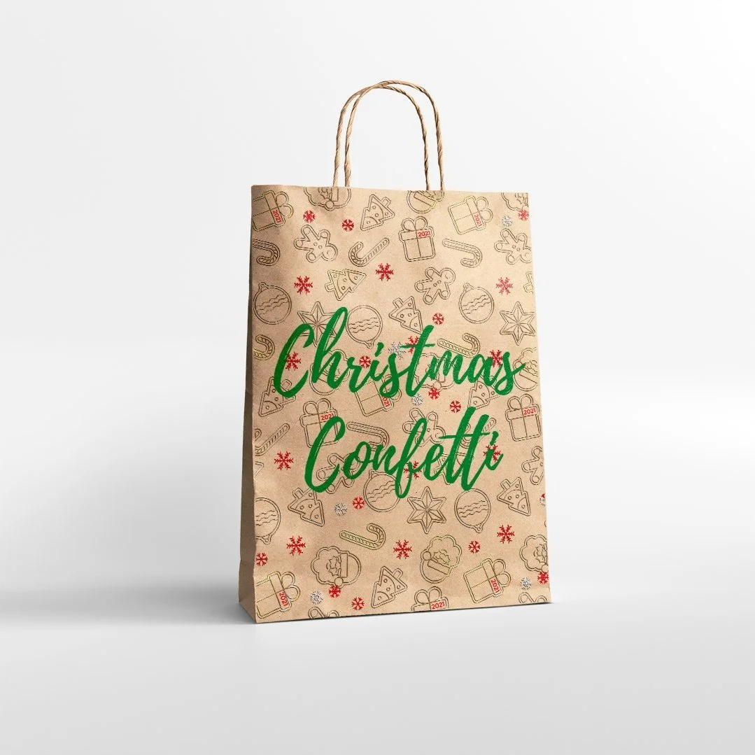
Christmas Confetti is the seasonal holiday decor store to make your home sparkle. It was an honor to create this modern brand logo that embraces the Christmas Season. This included logo and brand marketing material designs for all six locations. With trees that shimmer, baubles that glimmer. Christmas Confetti will make your holiday season shine!
The logo design for an amazing hospitality brand. They thrive on innovative ways to provide luxury accommodations as well as high quality business development for several organizations.
Follow them on Social Media
Integer a massa tortor. Lorem ipsum dolor sit amet, consectetur adipiscing elit. Nunc auctor enim sem, scelerisque lobortis leo euismod eu. Nunc in sem at nunc dapibus imperdiet. Morbi porttitor elit velit, quis dignissim velit varius eget.
Full Brand Redesign Idea for Burton Snowboards.
Brand Identity design for an Urgent Care Facility in Gallatin, TN. The clients were in search of a strong, timeless design that can grow with their business.
Moore Life Urgent Care offers traditional and non-traditional ambulatory/medical services. A caring experience, as well as personal and professional service, are what we believe in, and what we stand for.
Brand Logo Design for Local Atlanta Oil Transportation Company.
Logo and Web Layout design for a local festival in Atlanta, GA. The culture festival is gathering meant to celebrate the beauty of what truly makes the USA the greatest nation in the world: our diversity.
The project include apparel, flyer, and banner design. Along with photography for the event.
Website: The Culture Festival
Robert Half International, or commonly referred as, Robert Half, is a global human resource consulting firm based in Menlo Park, California founded in 1948. It is a member of the S&P 500, and is credited as being the world's first and largest accounting and finance staffing firm, with over 345 locations worldwide.
This was a design was for a volunteer event involving the Nashville Locations.
Brand Design for Force Athletics in Atlanta, GA. The brand's focus is to empower local communities through health and the proper training of the mind and body.
Brand, Web, Marketing & Advertising and IOS design for a dynamic local church in Atlanta.
Brand Logo and Packaging Label Design for an all-natural wellness product company based out of Nashville. (Start-Up Company)
Logo Identity for a local church in Nashville, TN. The vision was to create a logo that represented unity.
The Brand Design for Live The Moments.
A non-profit organization that provides support for families who experience the effects of Alzheimer's and Dementia.
Full-Scale Brand Redesign Project Idea for Emerson Tech.